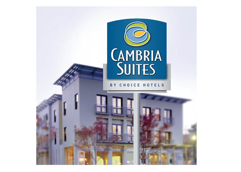
Choice Hotels, Cambria Suites
The vision for Choice Hotel’s newest property was to appeal to both the business and leisure traveler with a sophisticated and contemporary hotel experience o
ffered at surprisingly reasonable rates. Our branding solution refl
ects the fresh, upscale and personal style that infuses the design scheme. Th
e focal point of the new brand identity is the icon as a modern, dynamic and abstract expression of earthly elements and the journey ahead. Th
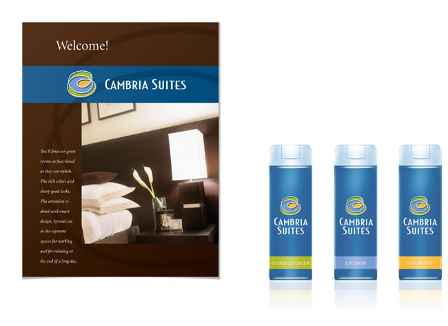
e brand was adapted to a range of applications from signage and brochures to amenities.
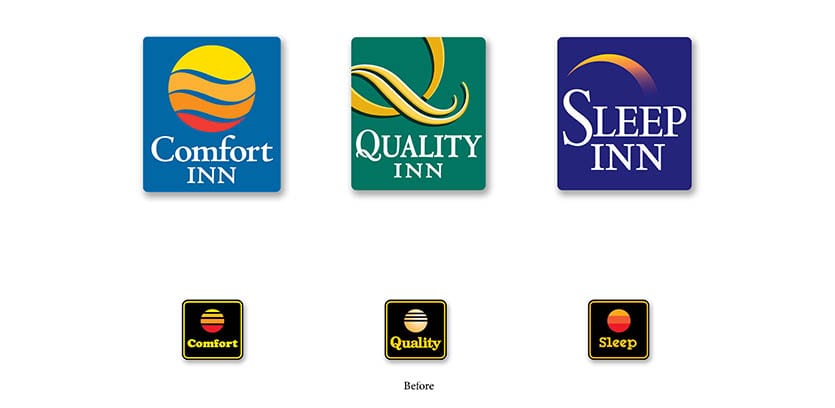
Choice Hotels
Choice Hotels has an impressive portfolio of properties, but customers were nding it hard to distinguish between the brands; each utilized an almost identical sun icon originally developed for their Comfort Inn chain over 25 years ago.
We revitalized all of their brands to enhance di
fferentiation while maintaining the equities of each individual chain. Th
e Comfort Inn brand was kept closest to the previous brand equity; Quality Inn, Comfort Suites and Sleep Inn were pushed further to create crystal-clear diff
erentiation within the portfolio, while making sure each dovetailed with the other for a cohesive strategy.
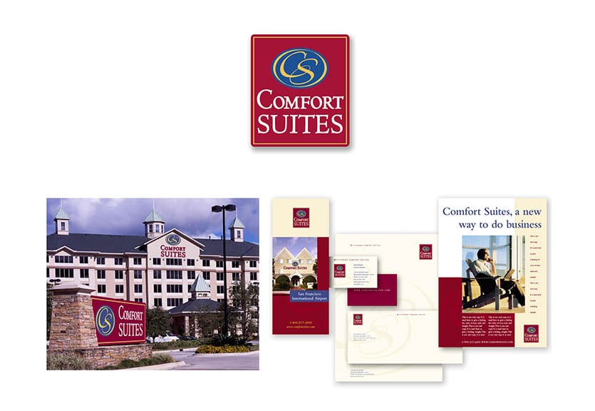
The new branding was applied to all of the properties’ marketing materials and hotel amenities to build loyalty and brand recognition.
The new branding was applied to all of the properties’ marketing materials and hotel amenities to build loyalty and brand recognition.