Raybern’s Foods
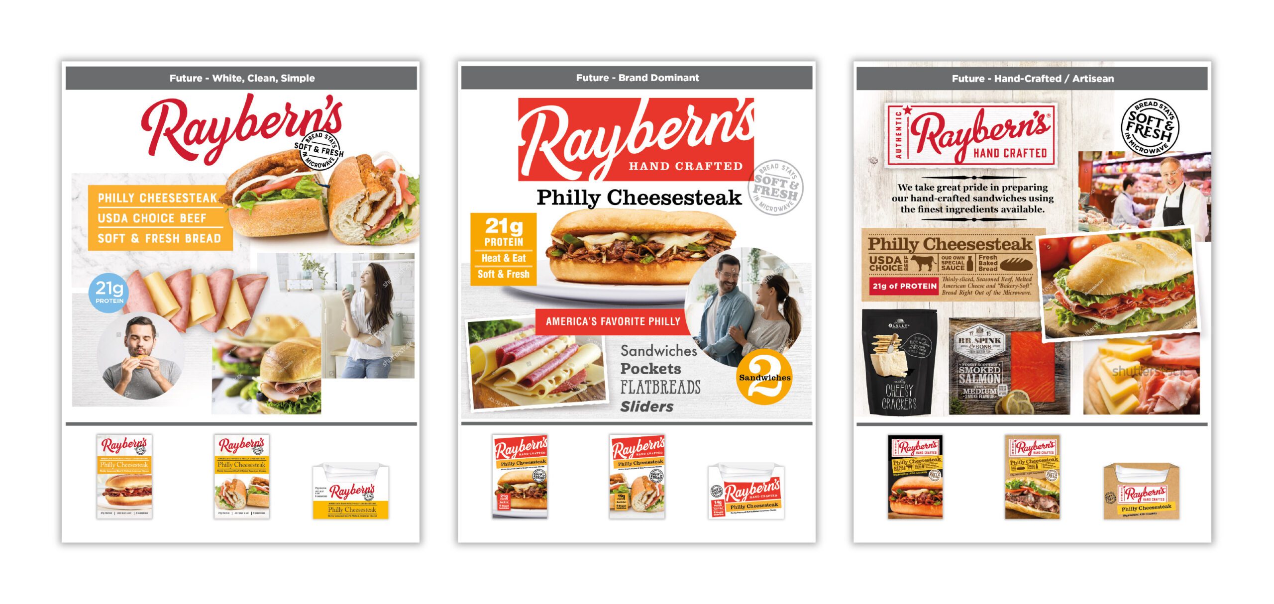
BergmanCramer conducted extensive research prior to beginning the redesign of Raybern’s sandwich line.
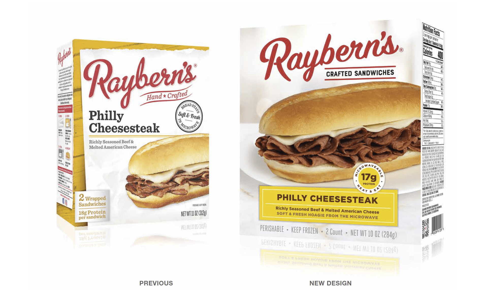
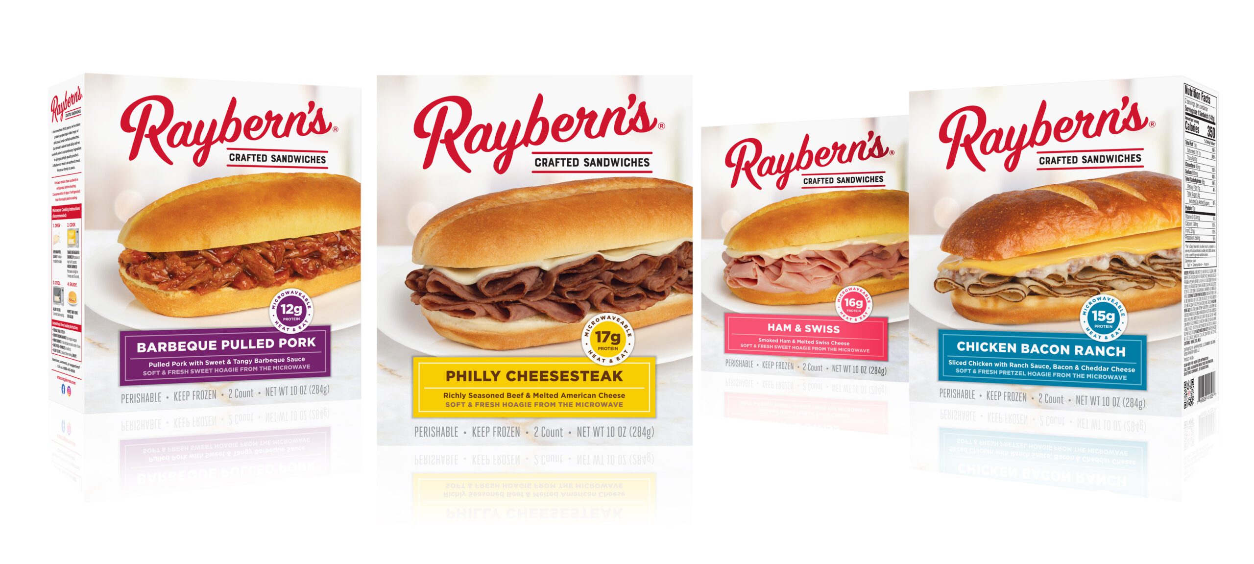
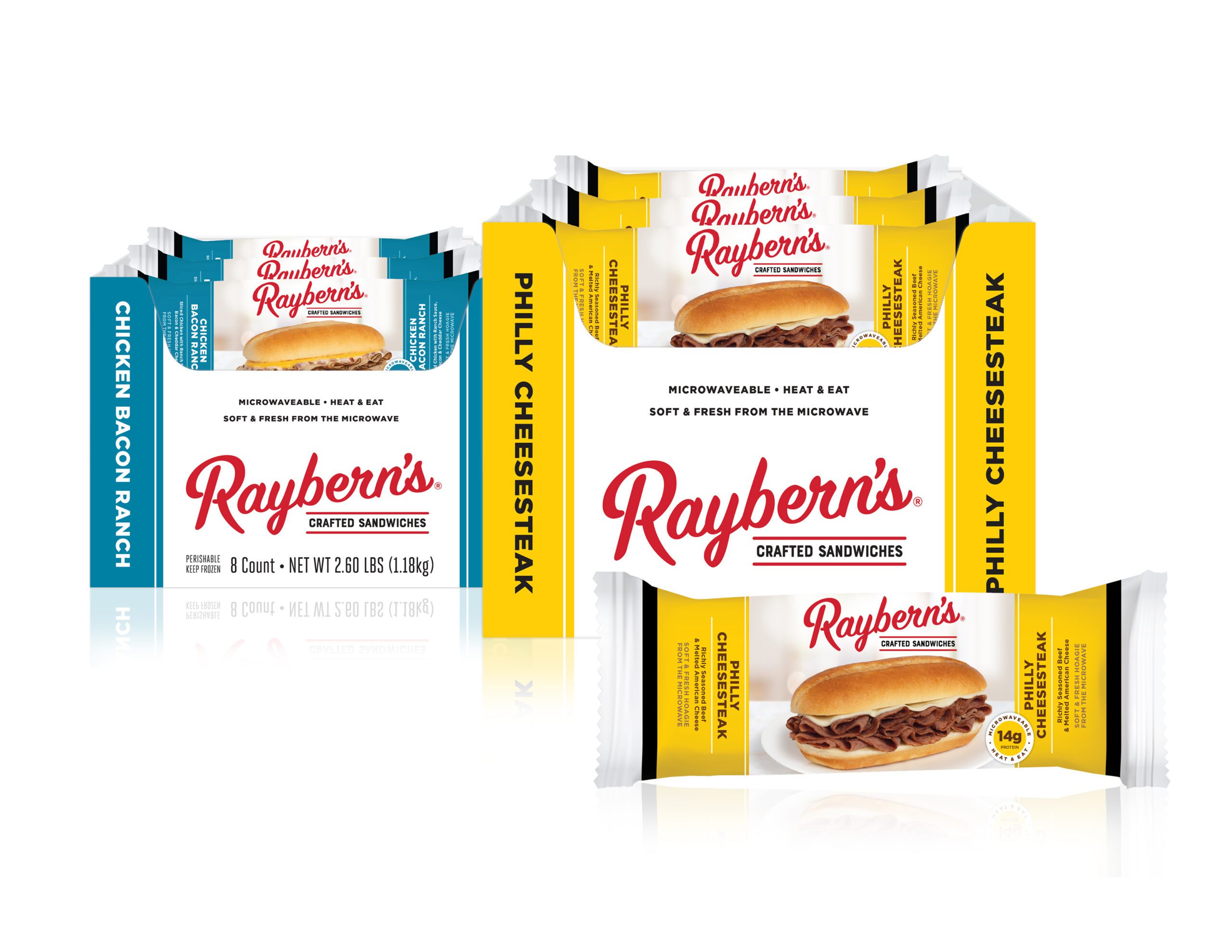
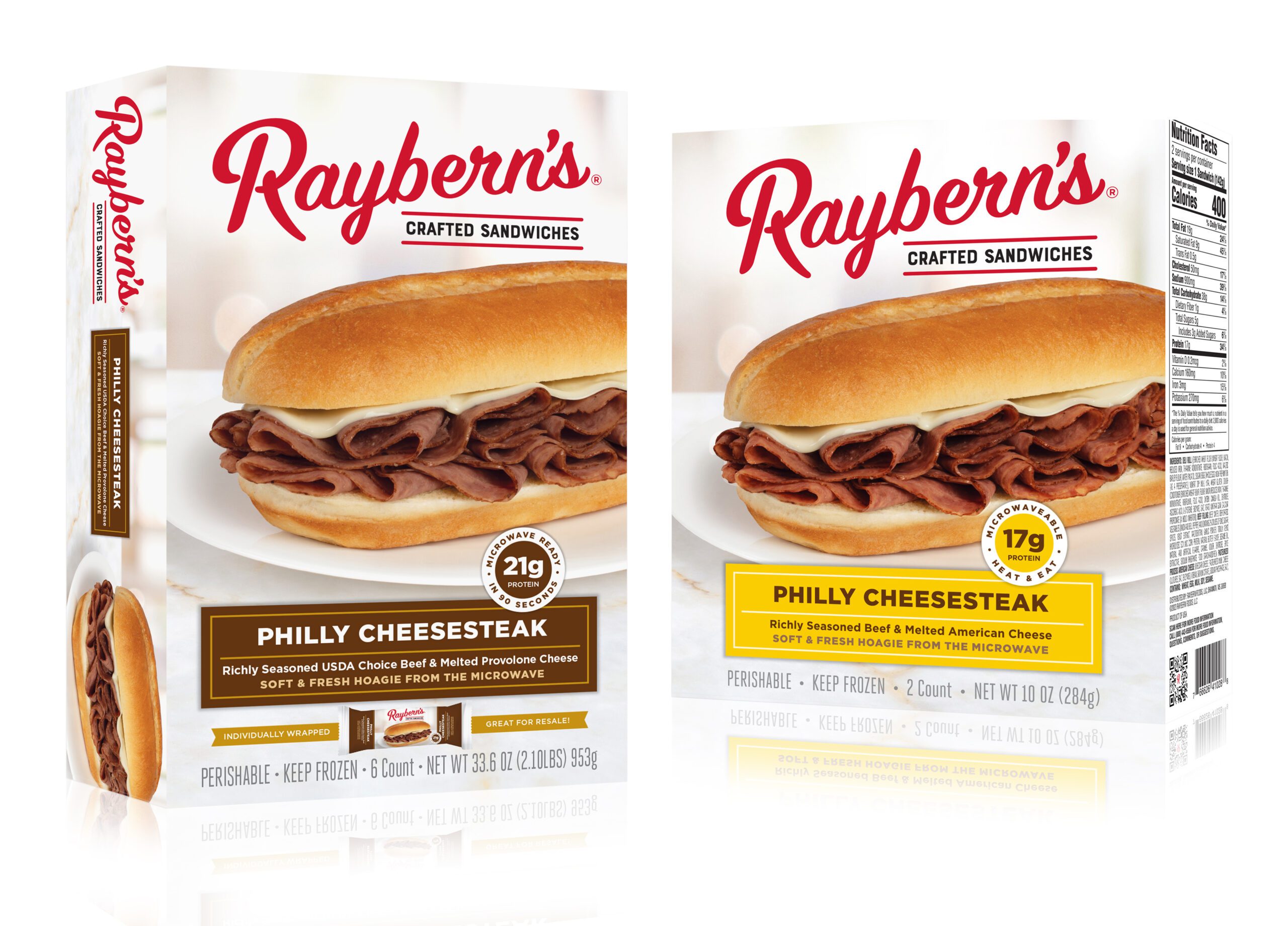
One of the outcomes was the creation of a range of positioning platforms. To reflect the improved product profile and authenticity of Raybern’s Sandwiches, we updated the package architecture, including a simplified logotype and a flavor tag that combines all product communication in one place. We also created new photographs of the sandwiches, placing them in an environment to improve appetite appeal.
![Raybern’s Foods](https://b1467601.smushcdn.com/1467601/wp-content/uploads/2024/05/3_Position_Concepts-scaled.jpg?lossy=1&strip=1&webp=1)
![Raybern’s Foods](https://b1467601.smushcdn.com/1467601/wp-content/uploads/2024/05/1.png?lossy=1&strip=1&webp=1)
![Raybern’s Foods](https://b1467601.smushcdn.com/1467601/wp-content/uploads/2024/05/Rayberns_4_SKUs_2024-scaled.jpg?lossy=1&strip=1&webp=1)
![Green Thumb Foods](https://b1467601.smushcdn.com/1467601/wp-content/uploads/2024/05/8ct_DG-PHC_Carton_3D-scaled.jpg?lossy=1&strip=1&webp=1)
![Raybern’s Foods](https://b1467601.smushcdn.com/1467601/wp-content/uploads/2024/05/Rayberns_retail_Costco_2024-scaled.jpg?lossy=1&strip=1&webp=1)