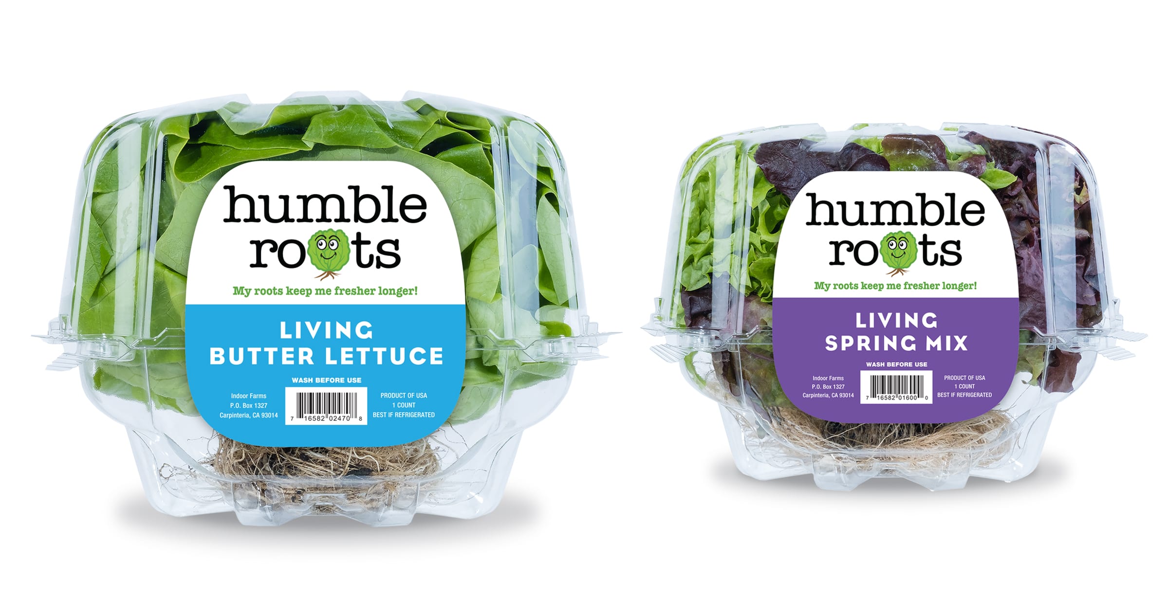
Hollandia Produce
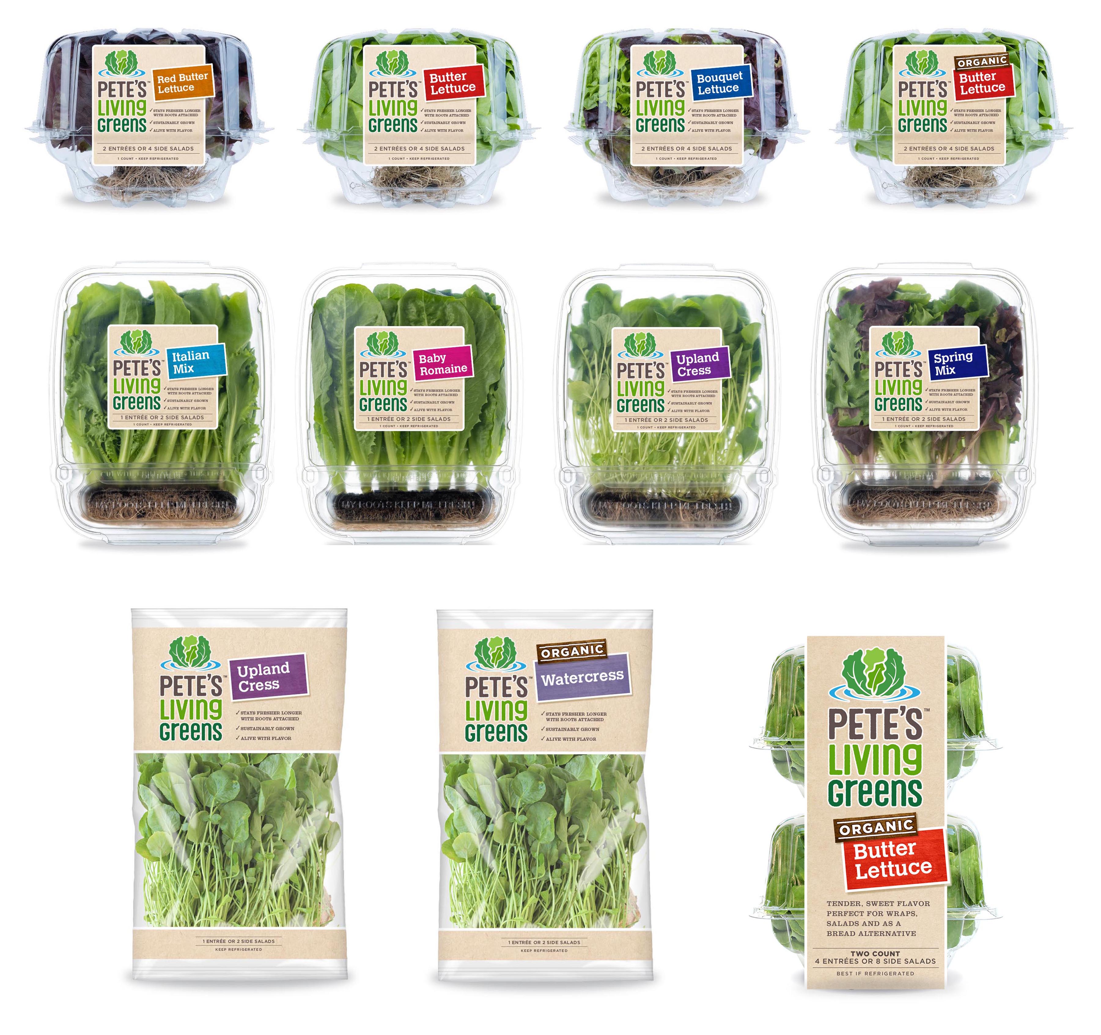
We created a unified branding to optimize marketing dollars and expand distribution at retail.
The new logotype reflects the notion of innovation, freshness, hydroponics, great taste, and exceptional quality.
Before
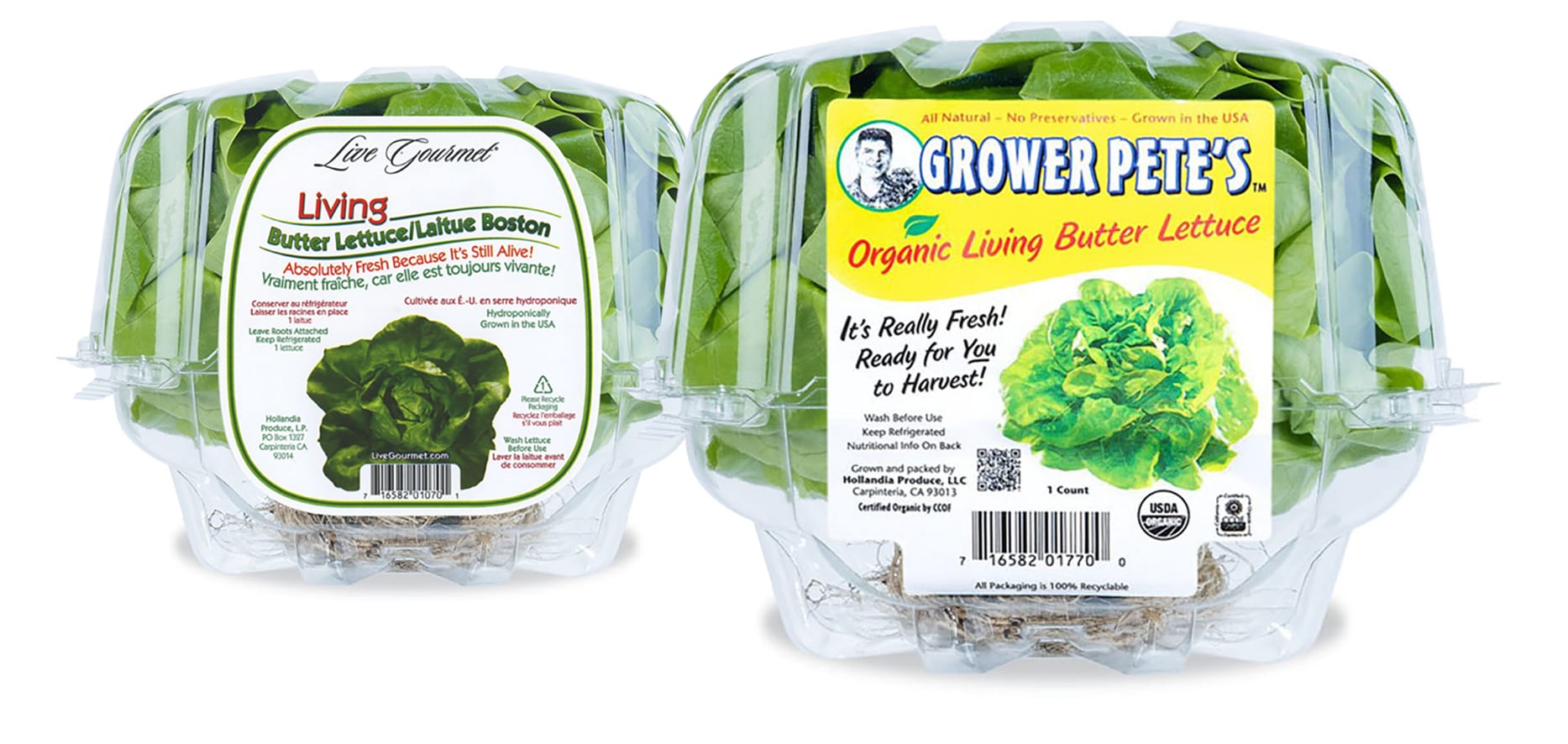
Hollandia Produce
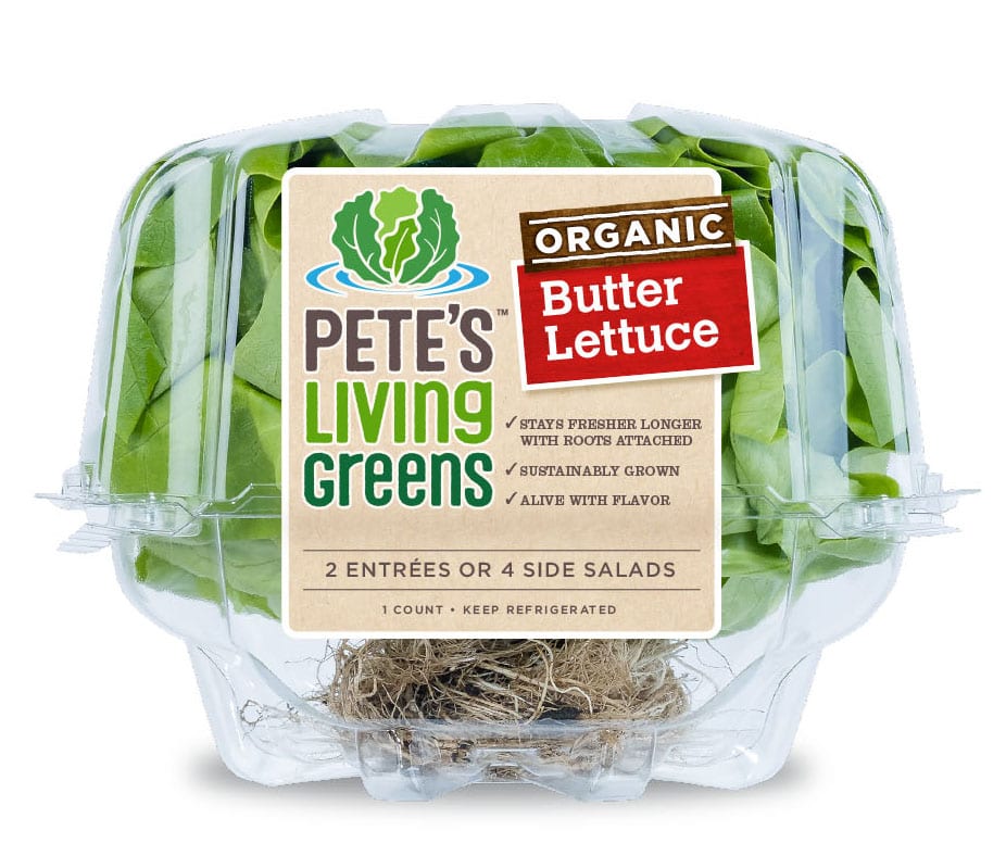
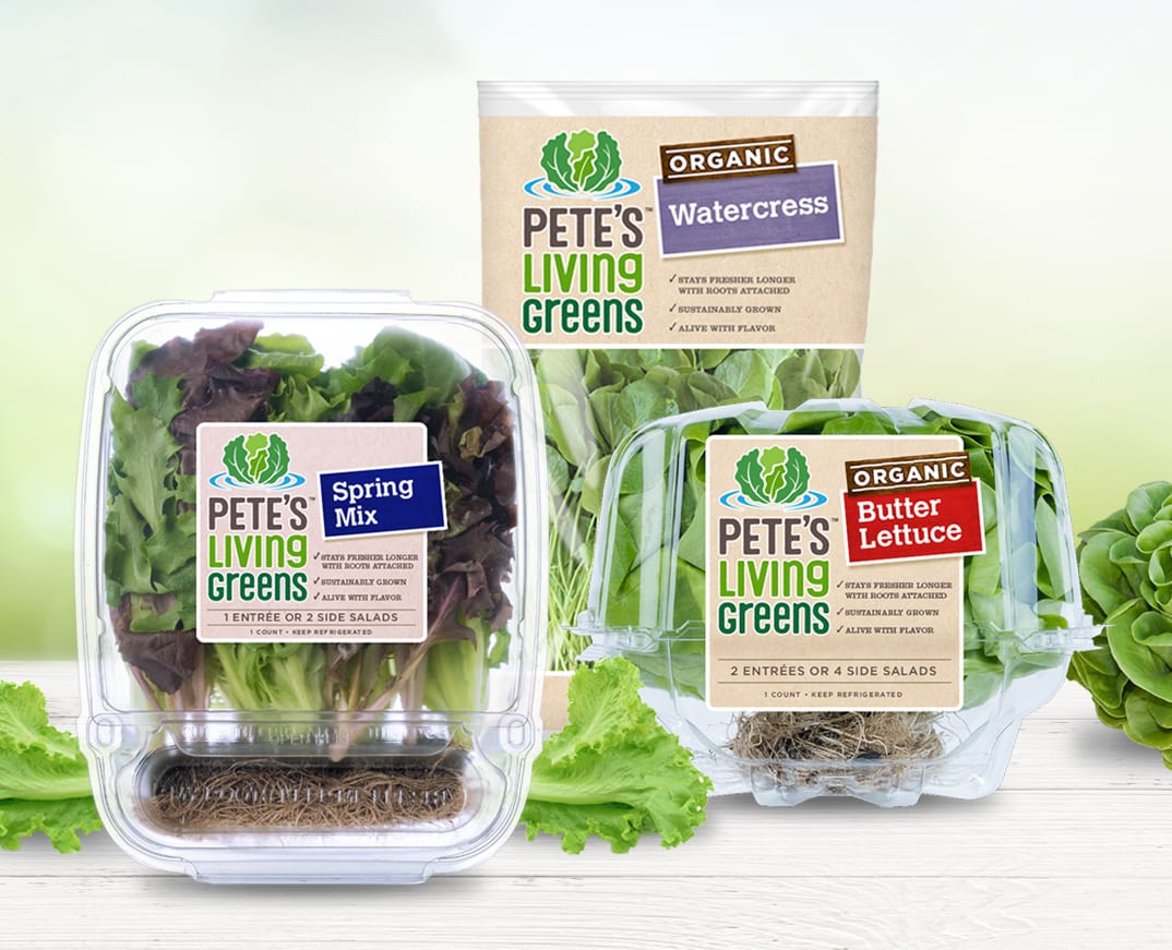
We created this “second” tier line for lettuce that does not meet the high standards of Hollandia’s mainline because they may look a little bit funny.